As more platforms and devices embrace dark mode as a default or preferred user interface option, designers must evolve their branding strategies accordingly. In this new visual landscape, logos that once looked stunning on white or light backgrounds may now fall flat or become illegible. The need to adapt isn’t just about aesthetics—it’s about maintaining usability, professionalism, and brand consistency across all digital environments.
TL;DR
Dark mode design is on the rise, and your logo must be part of that evolution. Logos optimized for dark backgrounds not only preserve brand integrity but also enhance visual appeal and viewer comfort. Some of the most effective logo styles for dark mode include high-contrast minimalist designs, metallics, and negative space creations. Read on to discover seven logo styles that truly shine in the darkness.
1. High-Contrast Monochrome
One of the most popular and effective solutions for dark mode environments is the high-contrast monochrome logo. Typically rendered in white or a very light shade, these logos cut through the darkness without relying on intricate detail or color variation. This style ensures maximum legibility, even in low-light settings, and aligns well with modern UI trends.
Tech companies like Apple and Slack use this approach across their product interfaces for a reason—it is both functional and elegant.
Key advantages include:
- Clarity: Crisp, legible lines that read well even at smaller sizes
- Versatility: Minimal adjustment needed across different platforms
- Scalability: Remains effective across a range of resolutions and devices
2. Metallic Gradient Logos
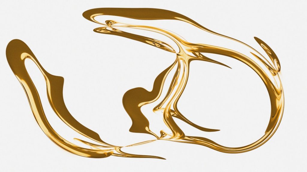
Dark backgrounds provide an excellent canvas for metallic gradients, which can add an extra layer of sophistication to a brand identity. Chrome, bronze, gold, and copper tones stand out dramatically against black or deep navy, providing a luxurious and polished feel.
Many premium brands—particularly in fashion, automotive, and technology—employ metallic gradient logos to enhance brand perception and deliver an exclusive look.

Take care not to overuse this style, as excessive gradients can feel outdated. For best results, stick to subtle transitions and restrained embellishments. This style works particularly well in industries where elegance and status matter.
3. Negative Space Mastery
Designers who truly understand the power of simplicity often use negative space in logo construction. When optimized for dark mode, these logos leverage empty areas to define shape and concept. Famous examples include the FedEx arrow or the WWF panda—clean, minimal, and undeniably effective.
Why does this work so well on dark backgrounds?
- Depth: Negative space offers a sense of dimensionality without clutter
- Timelessness: Minimal styling tends to age well and avoids trend fatigue
- Recognition: Strong use of negative space creates memorable experiences
In dark mode, these visual spaces become even more dramatic, adding intrigue and surprise when executed well.
4. Outline Logos
A modern, tech-friendly option for dark mode visibility is the outline logo. These usually consist of thin, open shapes or line drawings that are often animated or interactive on websites and apps. Their simplicity allows them to stand out sharply in dark environments while offering a contemporary feel.

While outlines are striking, they must be used with care. Insufficient line thickness or poor contrast can result in visual fatigue or invisibility in poorly calibrated screens. Always test extensively across multiple dark environments before finalizing an outline logo for dark mode use.
5. Duotone Colors with Neon Accents
For brands targeting younger or more progressive audiences, duotone designs paired with neon accents can deliver a bold identity in dark mode. Think electric blues, vibrant magentas, and acid greens layered against grayscale foundations. The contrast is daring, ensuring instant visual attention without sacrificing legibility.
This style suits the entertainment, gaming, and streaming sectors especially well. Consider examples like Twitch or Spotify, where color contrasts support brand recall and inject energy into the interface.
Key tips:
- Keep the color palette limited to avoid visual clutter
- Use brighter hues only for focal elements
- Check accessibility compliance related to contrast ratios
6. Flat Icons with Depth Effects
Dark mode is also the perfect foil for flat design logos enhanced with subtle depth cues. Techniques like inner shadows, semi-transparent highlights, and layered planes create a pseudo-3D appearance without straying from modern digital aesthetics.
These logos strike a fine balance between minimalism and motion. They feel dynamic and current without resorting to heavy gradients or animations. Google and YouTube have used similar tactics to adapt their icons for both light and dark environments.
Combine this style with soft transitions and balance between flatness and dimension to maintain legibility and engagement.
7. Responsive and Inverted Variants
The seventh and perhaps most future-proof approach is to develop responsive and inverted logo variants. This strategy recognizes that dark mode isn’t a design trend—it’s a semi-permanent shift in user preference. As such, logos should dynamically adapt based on user settings, screen type, and usage context.
A responsive logo can shift from its full-color version to a simplified, high-contrast form optimized for darker screen settings. Inverted versions become visible without losing shape definition or brand recognition.
- Advantages: Tailored experiences for light and dark modes
- Brand consistency: Unified identity regardless of environment
- Future-readiness: Built for multichannel adaptability
This method is increasingly supported by modern platforms, from websites using CSS media queries to mobile apps built with theme-switching APIs. It’s a professional approach that speaks to scalability and design maturity.
Final Thoughts
Designing logos for dark mode isn’t about choosing one aesthetic over another—it’s about adaptation and accessibility. A logo that appears crisp, professional, and memorable in dark settings communicates to your audience that your brand is technologically aware, design-forward, and user-focused.
Whether you’re starting a new brand identity or refreshing an old one, consider these seven high-performance logo styles for dark mode:
- High-Contrast Monochrome
- Metallic Gradient Logos
- Negative Space Mastery
- Outline Logos
- Duotone with Neon Accents
- Flat with Depth Effects
- Responsive Inverted Variants
By incorporating these strategies, your logo won’t just survive the shift to dark mode—it will thrive in it.
